Ways by which Flex Box makes your life easier in Web Dev
Mastery in Flex Box makes you master in responsive design too.

I am Pukhraj Singh, web developer. I love to explore new things. I coverted the various fabulous web designs into actual front end websites.
Flex Box
Flex Box is css container property which is the most used property in css for designing a responsive website.Due to which it's the most important property of css. If you learn this property well, then trust me your web dev life is going to be much easier.
Let me explain you it's benifits with the help of coding
Flex Box is a container property so we apply this property to the outer container (outer div) which effects the children of the container (outer div).
Code of body tag of html file
    <div class="gallery">
      <img
        src="https://images.unsplash.com/photo-1519681393784-d120267933ba?ixlib=rb-4.0.3&ixid=MnwxMjA3fDB8MHxleHBsb3JlLWZlZWR8MXx8fGVufDB8fHx8&w=1000&q=80"
        alt=""
      />
      <img
        src="https://images.pexels.com/photos/618833/pexels-photo-618833.jpeg?cs=srgb&dl=pexels-sagui-andrea-618833.jpg&fm=jpg"
        alt=""
      />
      <img
        src="https://images.unsplash.com/photo-1434394354979-a235cd36269d?ixlib=rb-4.0.3&ixid=MnwxMjA3fDB8MHxzZWFyY2h8MTJ8fG1vdW50YWluc3xlbnwwfHwwfHw%3D&w=1000&q=80"
        alt=""
      />
      <img
        src="https://images.pexels.com/photos/618833/pexels-photo-618833.jpeg?cs=srgb&dl=pexels-sagui-andrea-618833.jpg&fm=jpg"
        alt=""
      />
      <img
        src="https://images.unsplash.com/photo-1519681393784-d120267933ba?ixlib=rb-4.0.3&ixid=MnwxMjA3fDB8MHxleHBsb3JlLWZlZWR8MXx8fGVufDB8fHx8&w=1000&q=80"
        alt=""
      />
      <img
        src="https://images.unsplash.com/photo-1434394354979-a235cd36269d?ixlib=rb-4.0.3&ixid=MnwxMjA3fDB8MHxzZWFyY2h8MTJ8fG1vdW50YWluc3xlbnwwfHwwfHw%3D&w=1000&q=80"
        alt=""
      />
    </div>
Here as you can see,we have div of class gallery which is the outer div and it contains img tag which acts as children of this div. We are going to apply flex box to this gallery class div and try to show some horizontal card like structure with it.
Code of css file
      .gallery {
        display: flex;
        justify-content: center;
        flex-wrap: wrap;
      }
      .gallery > img {
        height: 400px;
        margin: 4px;
      }
      @media only screen and (max-width: 800px) {
        .gallery > img {
          height: 250px;
          margin: 4px;
        }
      }
display
Here as you can see we have a display property and it's value is flex which tells the css that display is going to be flex
justify-center
we also have justify-content property and we set it to center which tells the css that children are going to be center align and in horizontal direction.
flex-wrap
The most important property that makes our cards responsive is flex-wrap property because it tells the css that if we are unable to adjuts cards in single row then try to adjust the remaining cards that won't in this row adjust in next row.This happens because it's value is set to wrap.
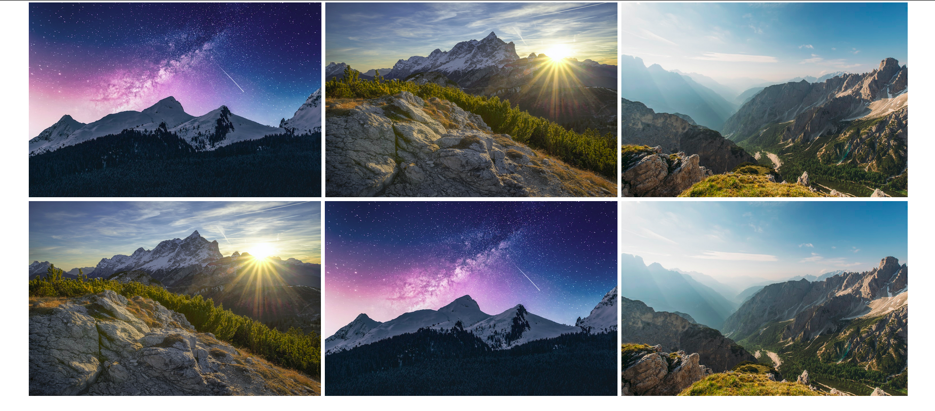
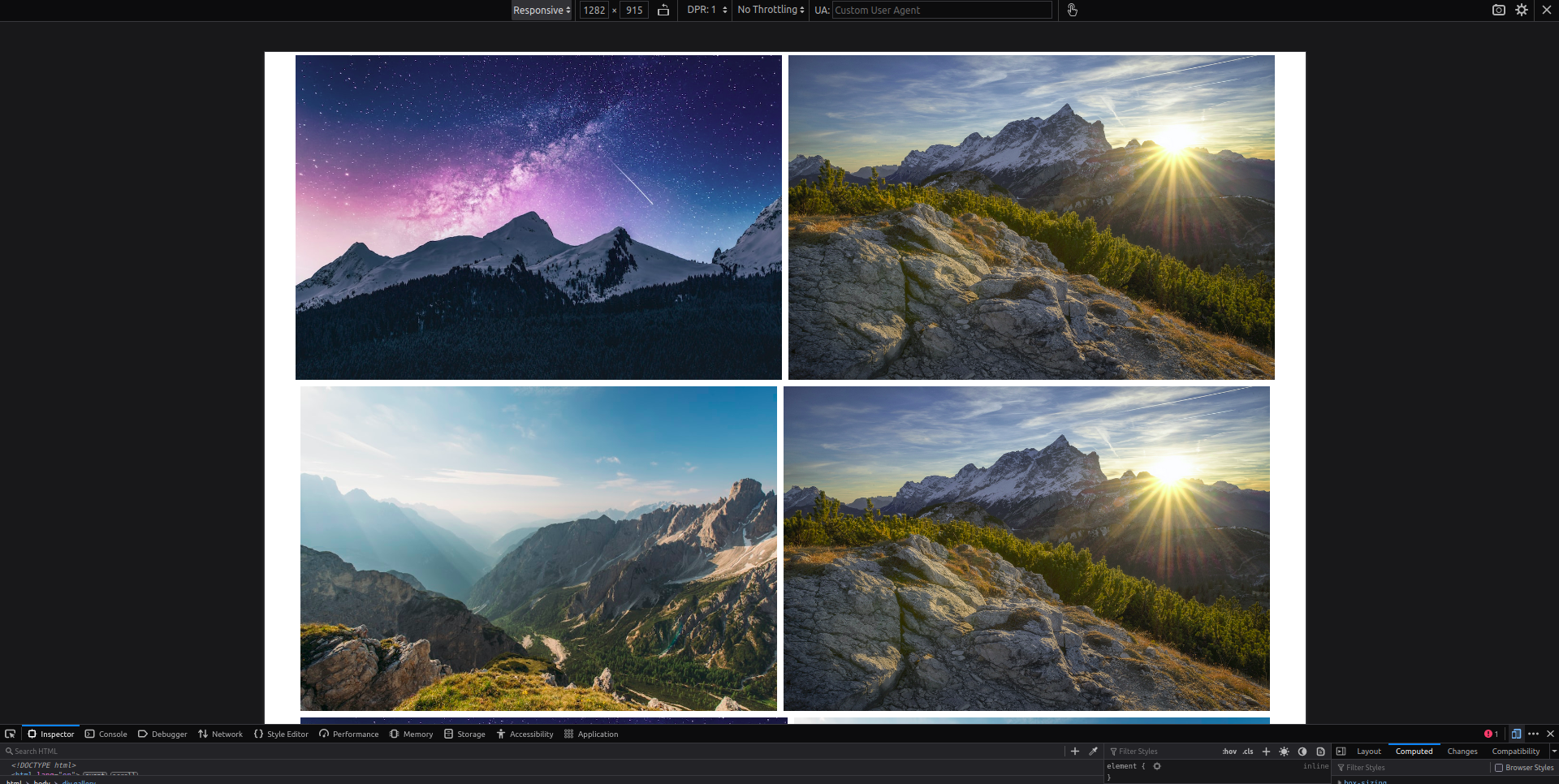
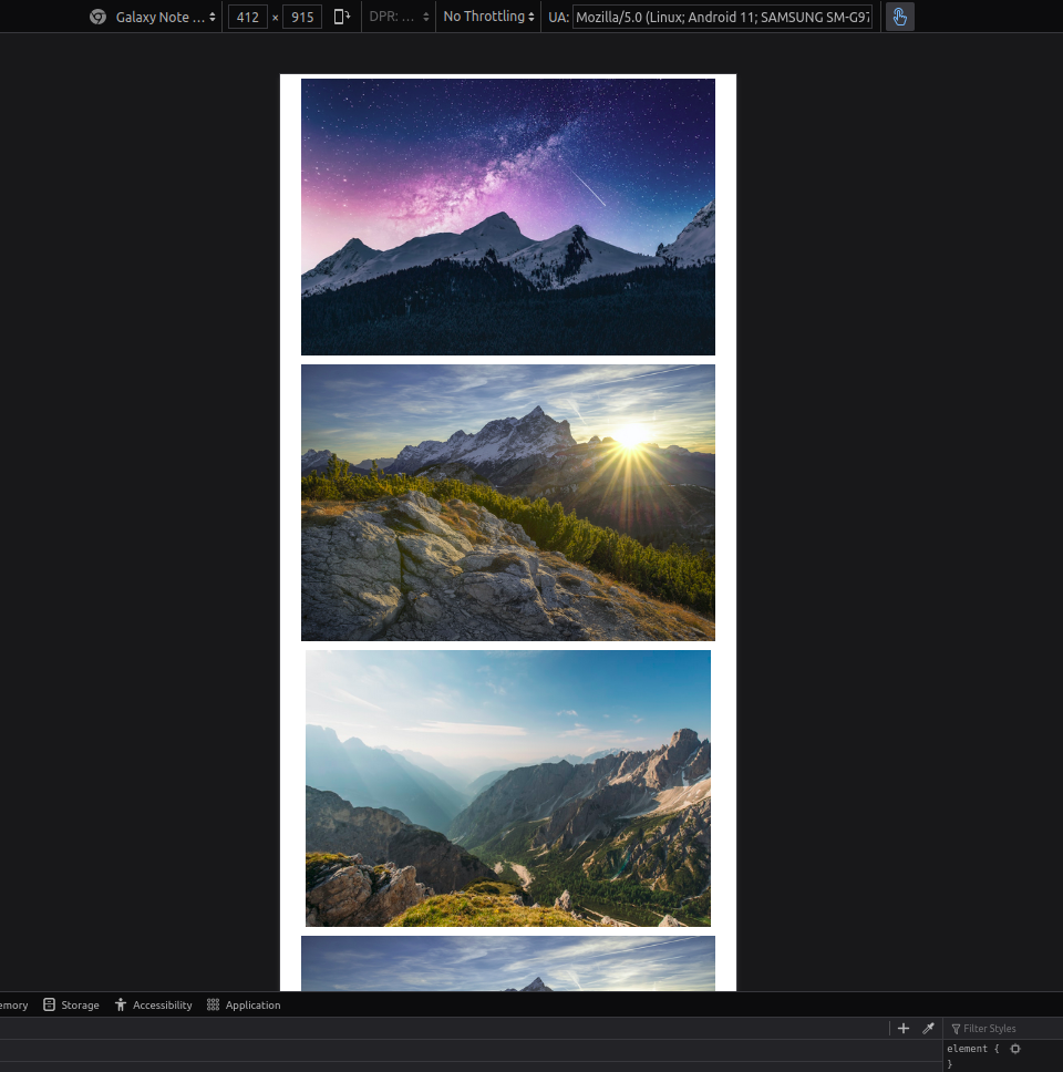
The output that we are going to get looks something like this
Desktop View
Tablet View
Mobile View
Note:-
Flex box either allow horizontal and vertical showcase of children with the help of flex-direction property. It's default value is row. Set it to column to make children show vertically.
      .gallery {
        display: flex;
        flex-direction:column;
        justify-content: center;
        flex-wrap: wrap;
      }
Conclusion
From this mini guide i just show you the smallest portion of it's power. The images cards that we generated here are responsive to all displays and the best part is you don't need to write complex media queries to achieve this objective.If you like my mini walkthrough, then you are going to love my other bolgs too. .


